History of the BBC ONE Idents
Since the launch of the channel in 1964, BBC ONE has seen nine different incarnations of the on-screen identity.
 | 1964 - The first ident was a continuation of the BBC-tv ident of 1963. It featured the globe on a white background. The original ident had a BBC-tv logo. This was changed to just BBC when the channel was launched. |
 | 1966 - While the BBC 1 ident symbol remained, a "watch-strap" globe was introduced in 1964, showing the globe in the middle of a striped band. In 1968, the channel converted to colour - the globe and BBC 1 logo remained. |
 | 1969 - The first colour ident was introduced. A blue and black mechanical globe rotated while a curved mirror placed behind made up the famous image. |
 | 1972 - The globe and colour scheme remained the same, but a rounder, italic font was used for the ident introduced in 1972. |
 | 1978 - A new blue and yellow globe was introduced. The colour was added using electronics and a new big bold font was introduced. |
 | 1981 - A colour change was made to the globe - yellow became green. The caption also changed to a double line version (similar to the BBC 2 logo of the time). |
 | 1985 - The new rotating gold and blue BBC 1 globe was introduced. Called COW, for Computer Originated World, it was the first time that BBC 1 had abandoned mechanical models and still slides and used a completely computer generated image. |
 | 1991 - The COW globe was replaced with a new on-screen image designed by Lambie-Nairn (who worked on the Nine O’Clock News ident). The design was a swirling world of shadows and reflections. |
 | 1997 - The new style BBC ONE ident and logo was dominated by the red and yellow globe balloon. The balloon was filmed flying over 10 different British locations. |
 The BBC One Balloon were the idents that were used on the channel between 4 October 1997 and 29 March 2002. The balloon theme replaced the computer generated spinning globe which had been used as the main idents on BBC One since 1991. (Wikipedia)
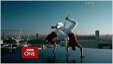 BBC 'Rhythm & Movement' idents were a set of on screen channel identities designed by lambie nairn and used on BBC One from 29 March 2002
 BBC ONE ident 2006 : Kites
 BBC ONE ident 2007 : Lawn - an homage to 'Stepford Wives'.
 BBC ONE ident 2008 : Penguins - first used as the Christmas ident in December 2007, this version without any festive trappings was introduced 5th February, 2008
 BBC ONE's ident for the June 2010 Football World Cup and subsequently added to the current rotation of idents.
 BBC ONE's Christmas 2011 ident - first broadcast 5.35pm on 10th December.
 2012 on the BBC - An Olympic year of programming. First shown on 1st January 2012. The music is 'Midnight City' by M83.
 he full 'Love 2013' promo that first aired just before 'New Year Live' on 31st December 2012.
Channel 4 Idents
 The award winning Channel Four identity was designed in 1982 by Robinson Lambie-Nairn. Having created the logo, Lambie Nairn then used a computer to animate outlines of the blocks to the final freeze. The movements were then hand colored and shot, but it didnt work, it was lacking shadow and lighting. So they decided to go to Los Angeles and Bo Gehring Aviation who specialised in computer animation to have differing sequences of the same basic symbol done entirely on computer, as at the time there was nowhere in the UK to go for this.

In the 1990s where 3-D logos are out and 'organic' logos are in, Channel 4 updated its image with a new circle theme. The four circle "connections" design along with its "slice of life" scenarios are the most substantial change to the network's image since its inception in 1982, with the original animated 3D coloured blocks.
 Homer Simpson and his quest for beer in this special ident for 'The Simpsons'.
 Towards the end of 2009, a new version of the channel's menu was introduced. Not as sleek as the original, the major differences can be seen in the size of the menu text, and also - for the first time - the physical shape of the '4' logo is shown, rather than being a knock-out effect.
 The award winning Channel Four identity was designed in 1982 by Robinson Lambie-Nairn. Having created the logo, Lambie Nairn then used a computer to animate outlines of the blocks to the final freeze. The movements were then hand colored and shot, but it didnt work, it was lacking shadow and lighting. So they decided to go to Los Angeles and Bo Gehring Aviation who specialised in computer animation to have differing sequences of the same basic symbol done entirely on computer, as at the time there was nowhere in the UK to go for this.
No comments:
Post a Comment