Thursday 24 October 2013

Ok Go Research


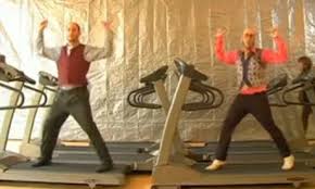
this music video is called"here it goes again" there is only one camera throughout the video and the camera angle is consistent throughout the video also. there is no editing in this video. The video took a total of 17 attempts to complete. The music video won the 2007 grammy award of best short form music video. This video is shot using a single camera technique. The reason for this is because it is cheaper than using multiple cameras and using one camera means that all the focus is on one specific point making it easier for the performers as they only have to focus on one point. 


This video is called ok Go- Needing getting. In this video, there are multiple camera used. shots are taken in the car, out the car and on top of the car. This video is sponsored by chevrolet and throughout the video the car is driven through a rally course. The arms on the outside of the car strike against pianos, guitars, glass jars and drums. Arrangement and tuning of the instruments make the melody of the song. This video was shot using one camera. This is called single camera technique. using this technique gives the view from inside the car so this gives the audience the same view as the performers in the car. 


Ok Go is an American alternative rock band. The band is composed of Damien Kulash, Tim Norwind, Dan Kanopka and Andy Ross. Ok Go formed in 1998 and released 2 studio albums. OK Go has earned considerable fame for their creative but often low-budget music videos, most of which have been promoted through Internet video sharing sites like YouTube. Many of these have become viral videos; the 2006 video for Here It Goes Again, in which the band performed a complex routine with the aid of motorised treadmills, has received over 50 million views four years later.


Tuesday 22 October 2013

15. Interview

1)What do you like about E4?

2)What is your favorite program on E4 and why?

3)What time do you usually watch your favorite program?

4)What do you like about the E4 idents?

5)Do you prefer animated or real life idents?

6)Do you like the current E4 logo and color scheme?

7)What do you expect to see in an E4 logo?

8)How would you improve the E4 logo?


Question 1. 

1) I like the programs they broadcast.
2)The shows they broadcast are fun and amusing.
3)I like the idents they broadcast. A lot of random things happen in them.
4)The logo and color scheme are eye catching.
5)I do not really watch E4 


Question 2.

1) Big bang theory is my favorite show because it is hilarious.
2) How I met your mother is my favorite show because it makes me laugh.
3) New girl is my favorite because I like zooey.
4) Big bang is my favorite because I think sheldon is mental.
5) Big bang is also my favorite because I love it.


Question 3.

1) I usually watch Big Bang at 8 p.m.
2 I watch E4 at either 6 p.m. or 8 p.m.
3) I watch New Girl when ever it is on.
4) I watch E4 everyday from 4 p.m. to 8 p.m. 
5) I do not really watch E4. 


Question 4. 

1) I like the fact the E4 idents are totally random.
2) The E4 idents are fun
3) I like the way the E4 idents have a mixture of animation and real life in them.
4) I like the music that goes with the idents.
5) The idents are mad and random, I like that.

Question 5.

1) I prefer animated idents.
2) I prefer animated idents.
3) Real life idents are better.
4) I prefer when idents are both animated and and real life.
5) I prefer animated idents


Question 6.

1) Yes I like the current logo and purple color scheme.
2) Yes I like the current logo and purple color scheme.
3) I like the logo but I am not to keen on the color scheme.
4) Im not too keen on the logo but I love the logo.
5) Yes I like both the color scheme and logo.


Question 7.

1) I would expect to see the purple color scheme and for the logo to stand out.
2) I would expect the logo to be recognizable.
3) I would expect the logo to be purple and fun.
4) I would expect to see the purple color scheme and for the logo to stand out.
5)  I would expect the logo to be recognizable.

Question 8.

1) I personally would add more color to the E4 logo.
2) I would not change the logo at all.
3) I would make the logo slightly bigger.
4) I would not change the logo.
5) I would not change the logo, I think its marvelous.


14.survey analysis

Gender:
 7 men and 3 girls completed my survey


Age:


Under 15: 1
16-18: 3
19-21: 5
22-24: 1
25+: 0


Do you like the colour scheme of the ident?

yes: 8
no: 2


Do you prefer animated or real life idents?

Animated: 5
real life:4
unsure: 1


What time do you watch E4?

12pm-2pm: 1
3pm-5pm: 1
6pm-8pm: 4
9pm-11pm:3
11pm onwards: 1


what is your favorite show?

Big bang theory: 4
Scrubs:1
rules of engagement: 1
how I met your mother: 1
New girl: 1
two broke girls: 1
Other: 1


Do you like the E4 idents?

Yes: 9
No: 1
Unsure: 0


Ethnicity?

White british: 6
black caribbean: 1
Black british: 1
Asian: 1


occupation:

student: 7
Unemployed: 0
laborour:1
professional: 2


What do you like about E4?

3 people said they liked watching it because of the wide range of shows.

1 person said there was nothing they liked about E4.

6 people said they enjoyed watching E4.


1. This pie chart shows the amount of males and females that took my survey. As you can see more males took this survey than females. 
2.  This pie chart shows the range of ages that took this survey. As you can see the majority of the people are ages between 16-18. 
3. This pie chart shows the range of different ethnicity. As you can see the main ethnicity that took part in the survey is white British. 
4. This pie chart shows the different occupations in which the people that took the survey are. As you can see a very large percentage of the people that took the survey are students and unemployed. 
5. This pie chart shows the different programmes that are shown on E4. As you can see "How I Met Your Mother" is the most popular program voted by the people that took the survey.This helps me decide when to show my ident. 
6. This pie chart shows what people like to see in an ident. The most popular things that people like to see in an ident are creativity and colours that follow the colour scheme of the channel. This will also help me make my ident appeal to my target audience. 
7. This pie chart shows the types of programs shown on E4. As you can see the most popular genre is comedy. This will help me decide what programs to show me ident before. 
8. This pie chart shows the different times of day in which people watch tv. The most popular times is late evening and early morning, this will help me decide when during the day i should show my ident. 
9. This pie chart shows whether people like the colour scheme of E4 or not. The results shows 50/50. 
10. This pie chart shows whether people like animation idents or not. The results show that the majority of the people that took the survey do not like animated idents. 


10.logos


Friday 18 October 2013

music video director

Spike jonze is american director, screenwriter, producer and actor whose work includes music videos, commercials film and television. jonze is well known for his music video collaborations with fat boy slim, weezer and beastie boys. He has been nominated for four academy awards, these include best director best picture, best original screenplay and best song. Jonze is well known for his music video collaborations with Fatboy SlimWeezerBeastie Boys, and Björk. He was a co-creator and executive producer of MTV's Jackass. He is currently the creative director of VBS.tv.He is part owner of skateboard company Girl Skateboards with riders Rick Howard and Mike Carroll.


Hype Williams has earnt his living by directing music videos and films for artists such notorious B.I.G, jay-Z and kanye West. 

What makes a hype williams video: hype williams videos will be colourful, meaningful, modern and he willl usually use a fish eye lens which will distort the camera view around the main focus. A signature style used by Williams throughout the vast majority of his videos (shot mostly with cinematographer John Perez) was the Fisheye lens which distorted the camera view around the central focus. This was used by the tandem Williams/Perez in "Gimme Some More" by Busta Rhymes and "The Rain (Supa Dupa Fly)" by Missy Elliott; however, it was dropped by 2003, when he experienced his lowest level of production activity since the beginning of his career as a music video director.


emotional response


In the video paradise by Coldplay released on the 12th september 2011, the lyrics they use represent 'the elephant' escaping from the zoo to go to 'paradise'. The video its self shows the elephant on his journey. There isn't much editing in this video apart from the band performing on stage. There are two types of performance in this music video, there is the performance of the 'elephants' and then the band actually performing on stage. There is only one camera used in this video apart from the band performing on stage, then more than one camera is used. The elephant costumes are very promotional to the music videos because they give the video character and a sense of fun.


In the video jar of hearts by Christina Perri released on the 27th of July 2010, the lyrics cold as ice represent the cold dark theme of the video. The editing of the video switches between a dark grey background and a brighter white background representing her emotions of being happy and sad. Her performance tells a story of her being sad to throughout the video her getting more increasingly happy. The camera use in this shows a number of differnt shots, for example it shows close ups of her singing and shots of her dancing. The video tells a story of her being heart broken. At the end of the video, she gets her 'jar of hearts' back which shows she is happy again and no longer heart broken.


In the video thriller released on the 2nd of december 1983 which is 13 minutes long by Michael Jackson The lyrics represent a story. And the lyrics link into the video and the performance by saying 'its close to midnight', the were wolf comes out at midnight and the whole video is based at midnight. The dancing in the video represents 'monsters ' the zombie dancing. The editing in the movie is a lot different to the other two videos, Michael Jackson turns into a werewolf and the zombies come out of the floor. This gives a horror effect to the video. The make up and monsters are very promotional to the video becuase they make the video more believable and scary.
Michael jackson was the first person to create the idea of a short film- a music video with a beginning, middle and end.


Wednesday 16 October 2013

3.Style guide


Logo: 
When ever possible the logo must always appear in the colour scheme purple and white. However there may be some situations where the colour can not show there for mono black can be used. The white circle (representing the eye) but always stay white and never be transparent. The purple paint splatter behind the main image of the logo must always stay a darker shade purple compared to the main image, it also must never be transparent. 

Logo Position: 
This E4 logo must always appear on the bottom right hand corner of the page, it should always be placed no closer than 10mm from the edge of the page. However if needed it can be placed on the top left hand corner of the page again placed no closer than 10mm away from the corners of the page. 

Logo isolation area: 
This E4 logo should always be surrounded by a minimum of 10mm of space. This measurement of space is a minimum, therefore meaning that it should be increased whenever needed. The area of isolation ensures that any text or other visual elements do not interfere with the logo. 

Colour: 
My E4 logo used purple as it's core colour and black in corporate within the logo. The only other variant of purple that is used within the logo is on the paint splatter effect shown behind the logo, which is a darker shade of purple compared to the purple used to create the main image of the logo. 

E4: 
The number four in the logo must always be presented in a numeral way (4) and must sit along side to the right hand side of the letter 'E'. As you can see in the image above, it shows the correct way to present the 'E4' within the logo. An example of an incorrect logo is 'EFour'. 

Typography: 
The E4 logo that i created uses custom font called "Graffiti", this is used for all brand identity. There is not a maximum limit to the font size, as long as it accommodates to size of the logo. The type must never be shown bellow 5pt. 

Type Colour: 
All font types should appear purple or white depending on the background it is shown on. For example if the type is shown on a purple background, it must appear white in order for the viewer to see the text. 

Logo Position and Size: 
When the logo is shown by itself, it should retain the lower left position in any air advertising format.