Friday, 15 November 2013

music video recipe

Music Videos:


The 1970s music videos are mainly of the band members/ singers performing on stage to a live crowd. The main genre of music in the 70s was disco music, which became one of the biggest genres of the decade. Other genres such as reggae and hip hop emerged in this decade.


The 1980s music is also videos of the bands performing but not necessarily of the band/ singers on stage. it is similar to the music of the 70s. this music video is primarily concentrated on the band and their singing. there is only one camera angle and no editing.


The 90s music is also similar to the music of the 70s and 80s however, there is more dancing involved, there are more cameras used and more camera angles. the music itself is faster. In the 90s hip hop grew and continued to be highly successful.


The 2000s music videos have a lot more cameras involved, more complex editing, more dancers and extras involved. The 2000s saw the creation of a few Indie- related genres such as emo and electronic genres such as liquid funk. The 2000s music videos started to use pitch correction and auto-tune.


The 2010s music videos have even more cameras used, even more complex editing. more props and extras are used and more money is spent on the videos. A lot of the videos take place abroad on beaches for example and show off a sex appeal rather than the talent of the artist.


To make a good music video you will need parts and influences from all these time periods, for example for me to make a good music video I would film the band/artist performing live as done in the 70's to the 90's, the music video would also have a story lines so that its not a pointless video. I will also include close ups of the artists as that seems to a main feature in all music videos throughout the years. In my opinion the video need to tie in with the song and make sense, so that the viewers can relate and get a better understanding of the song and the lyrics. 

Recipe: 

Close up of the artist/ act 
Shots of the brand/ artist preforming live 
Needs to have a story line 
Needs to make sense 
Different camera angles and shots 

9.Typography


This font is called called HFF kids stuff. i chose this font because kids can relate to it because there are pictures of kids having fun climbing on the letters.


This font is called Initials with curls. i chose this font because i believe it represents the way people would have written letters to each other.

This font is called Batman Forever, i chose this font because it has sharp edges and angles and is easy to read. therefore it makes it modern.

This font is called Billion stars. i chose this font because it is serif and looks like some one from high class has written it.


This font is called Art Brewery. I chose this font because it looks like its been written by a paint brush, at the bottom of a painting when the painter signs their work.


This font is called bonzai. i feel that this font represents the word fashion well because it is unique and stylish.


this font is called versity_regualar. i chose this font for sport because it represents an american college football team.


This font is called cactus sandwich. I believe that this represents the word comedy well because the font its self is funny.


This font is called CFanarchy_regular. I chose this font to represent the word drama because i feel it would be an appropriate font for a title of a TV show.


This font is called Always Forever. I chose this font because i think it represents the way teenagers would write in school or their diary.

single shot camera analysis

 This single camera shot is for a slow motion video for pedigree dog food. It is filmed using a phantom camera, it shoots 1000 frames per second.


This single camera shot is of NFL players showing off their skills to try and get chosen for the best team. They use this single camera technique so that the camera is always concentrating on the players.


The big bang theory uses the single camera technique because it is easier for the actors to concentrate on one camera than it is to concentrate on more than one. The director can then get the best performance from the one camera.


cinematography 180 degree rule and rule of 3rd video

The video 'Haven't met you yet' by Michael Buble is a good example of the 180 degree rule because there is a wide shot of him singing and immediately after is a close shot of him singing with the same background for both shots.


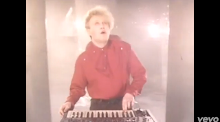
Rule of thirds:  This video I ran by flock of seagulls is a good example of rule of thirds as is shows the singer in the middle of the screen linked to the camera being central. And the keyboard he is playing is also in the centre of the screen which shows it has a key significance to the video. The rule of thirds is applied by aligning a subject with the guide lines and their intersection points, placing the horizon on the top or bottom line, or allowing linear features in the image to flow from section to section.


When you join shots together using shot reverse shot,  you need to be careful about eyeline match. This means that the gaze of the character in one shot has to line up with the person or thing they’re looking at in the next shot, as in Shots 3 and 4. To get this right, you should put both camera positions at a similar distance from the axis.


180 degree rule 
In film making, the 180-degree rule is a basic guideline regarding the on-screen spatial relationship between a character and another character or object within a scene. An imaginary line called the axis connects the characters and by keeping the camera on one side of this axis for every shot in the scene, the first character will always be frame right of the second character, who is then always frame left of the first. If the camera passes over the axis, it is called jumping the line or crossing the line. 

15. interview analysis

1) What do you like about E4?
The majority of answers I got from this question were that they enjoyed the shows that E4 broadcasted because they were fun and amusing. From this information, I made sure that my ident was fun and amusing so that it appeals to my target audience. I achieved this by making my main character melt and then get eaten by a monster.

2) What is your favourite program on E4 and why?
Most of the people I asked this question to said that The Big Bang theory was there favorite because they found it funny and amusing. So, for E4 to keep getting viewers and therefore better ratings, they should show more Big Bang theories because thats what the majority of the viewers want to see.

3) What time do you usually watcvh your favourite program?
The majority of people I asked this too said that they usually watch their favourite show at 8 p.m. This gives E4 a good indication of the peak times for them to broadcast their shows. So from this information, I would broadcast my ident at 8 p.m. so the majority of my target audience see my ident.

4) What do you like about the E4 idents?
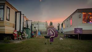
Nearly everyone I asked this question too said that they loved that fact that the idents are totally random and fun and that alot is happening all at once. So, this information can help E4, becuase now they know what the viewers want to see in an ident. From this information, I made my ident totally random and fun to appeal to my target audience. I achieved this by a random volcano erupting.

5) Do you like the current E4 logo and colour scheme?
Most of the people I asked this question too said that they love the purple colour scheme because it is unique and that the logo its self is fun and interesting. However, a few people said that the logo can be sometimes quite hard to read. From this information, I stuck to the purple colour scheme, but made sure that the writing stands out to my target audience.

6) Do you prefer animated or real life idents?
The majority of people said that they prefer animated idents because they are more fun. However, some people said that they love the fact that E4 do a mixture of both real life and animated idents because they are unique and fun. So from this information, I made sure that my indent was aimed to appeal to the majority of my target audience.

7) What do you expect to see in an E4 logo?
Everybody I asked said that they would expect to see the purple colour shceme, for the logo to be fun and interesting and to also stand out. From this information, I stuck to the purple colour scheme and my logo stands out to my target audience. I have achieved this by making my logo different and unique.

8) How would you improve the E4 logo?
A lot of people said that they wouldn't change the logo. However, the people that said they would change the logo said that they would change the size, either bigger or smaller, and that they would put a background behind the logo. From this information, I put my logo on a background to my my logo appeal to my target audience.


Call sheet


Day Of Filming: Monday

Times For Crew: 3:15

Times For Actors: 3:30

Weather Report: make sure its not raining

Props Needed: clothes, bench, trays, bin, food

Equipment Needed: cameras, tripod, microphone,

Shots Required:

Any Major Risks: The stairs could be a major risk if we were to fall down them, the weather could be a major risk, if its wet or icy it could be slippery.

1 days shooting.


7. re-branding


ITV Re-brand 
The main ITV logo is a colour-picking design which changes to suit its backdrop as well as the nature of its programming. The broadcaster's flagship channel changed its name from ITV1 to ITV, and, along with ITV2, ITV3, ITV4 and CITV, changed colour scheme to better reflect their programme mix. 

ITV idents 
As a brand at the heart of popular culture, ITV’s main channel now has a far broader range of idents, which capture moments from everyday life across the UK, featuring real people and real scenes. 

why did the rebrand occur? 

The rebranding of ITV will allow them to further cement the relationship in viewers' minds between our shows and the ITV brand that produces and broadcasts them. 
The logo is part of a multi-million pound rebrand, as well as introducing a new lower case logo, designed to look like joined up handwriting, the broadcaster renamed its flagship channel. Known as ITV1 since 2001 it will now simply be called ITV. The uses of colours also appeals to their target audience which is young family and any age above as ITV show a wide range of programs which include entertainment, wildlife and the news. 

E4 Re-brand 
E4 rolls out Eefer character in first brand refresh in six years. 


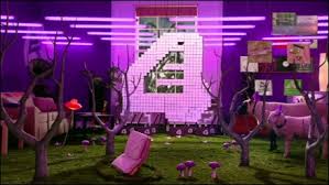
The broadcaster has taken inspiration from plastic peg display boards for the updated identity, while retaining the channel’s purple colouring. 
It is also rolling out a new brand character, "Eefer", a robotic embodiment of the channel’s familiar logo. 

Eefer will interact with viewers on social media sites such as Facebook, Twitter and Instagram, as well as E4’s YouTube and Spotify channels. 
They have designed Eefer like a human. he has the same logo but with arms, legs, eyes and a mouth. even though he has got a mouth he doesn't speak. He holds a board and the information is written on the board containing information on the next programme or up coming programmes. they use Effer like a normal human. 

E4 have decided to to bring back Eefer sinc he was in his last ident in 2003. they uses eefer also in there idents to make it more interesting and comical. 

E4 have got Eefer on there website as a whole different link he has a large picture with a billboard that shows hes going back, however showing his personality but making him sound real ' weather you like it or not' meaning he's coming back and if you don't like him then tough. its trying to make him sound real and large.